Hello World
🤨 What is this?
This is my new Website! Built from the ground up with a whole new tech stack that I selected based on what I have learn’t & been using over the past few months / years.
So, with the amount of work that went into re-building my current website but with a whole new look & a whole bunch of new features & options, I thought now this would be a good change to show some of them off.
❓ Why
In short, it was long overdue. I usually try to update my personal portfolio website every year or so. I use it as an opportunity to experiment, try new tech, new ideas, etc. However, due to complications I kept delaying it, putting it off & just never doing it. However as of late I had a burst of motivation to get it done & launched. My previous portfolio site I deployed back in the beginning of 2019 & does look alright even today. However, it was built thick & fast using VuePress & mean’t if I wanted to expand it & add new blog posts it was perfectly doable, but anything else would have taken a lot more work.
So, having been a few years since my last portfolio website launch I decided to work with a blank slate & see what I could make from scratch.
🔨 Tech Stack
The project built using the following tools & frameworks:
- ⚛️ React / Preact (For Production)
- 💪 Next.js
- 🔍 next-seo
- 🌙 next-themes
- 👩🎤 EmotionCSS
- 💄 Twin.macro (For Tailwind CSS)
- 🗼 Tailwind UI
- 🪶 Feather Icons
- 🗄️ Hookstate
- 👍 react-use
🤏 Vite
I originally began planning, designing & building this ground up re-build at the beginning on 2021 but had to later shelf it for a while due to personal complications taking priority.
When development first began I was planning on building the site using Vite & Vue 3 as at the time I was, and still do, love Vite & Vue.js. However, since then I have learned how to utilize other tools to make even better products faster. Next.js being the most obvious one. Vite’s hot module reloading (HMR) is insanely fast! To this day I do still think it is faster than Next.js (Even with the experimental ESModules feature flag enabled), however I was willing to make that trade off for the other features it offer out of the box compared to Vite.
I love Vite & Vue.js, but for this project, and potentially future ones, I have fallen in love with Next.js because of how much it offers.
✨ Features
With this new ground up re-build comes a whole host of new features & improvements.
⚛️ Preact
A small feature that I often forget I added but helps a lot with bundle size, is Preact.
In summary, my Next.js project is configured to replace React with Preact in production builds.
webpack: (config, { dev, isServer }) => {
    if (!dev && !isServer) {
        Object.assign(config.resolve.alias, {
            'react': 'preact/compat',
            'react-dom/test-utils': 'preact/test-utils',
            'react-dom': 'preact/compat',
        });
    }

    return config;
},
📕 Blog
As you can tell by the fact you’re currently reading this, I now have a blog! :tada:
This means that I finally have a place to create lengthy articles that can go more in-depth on topics I care deeply about. Eveyrthing from technical write-ups on new technology I am experimenting with, to other personal posts on hobbies enjoy, such as mechanical keyboards.
📋 Projects
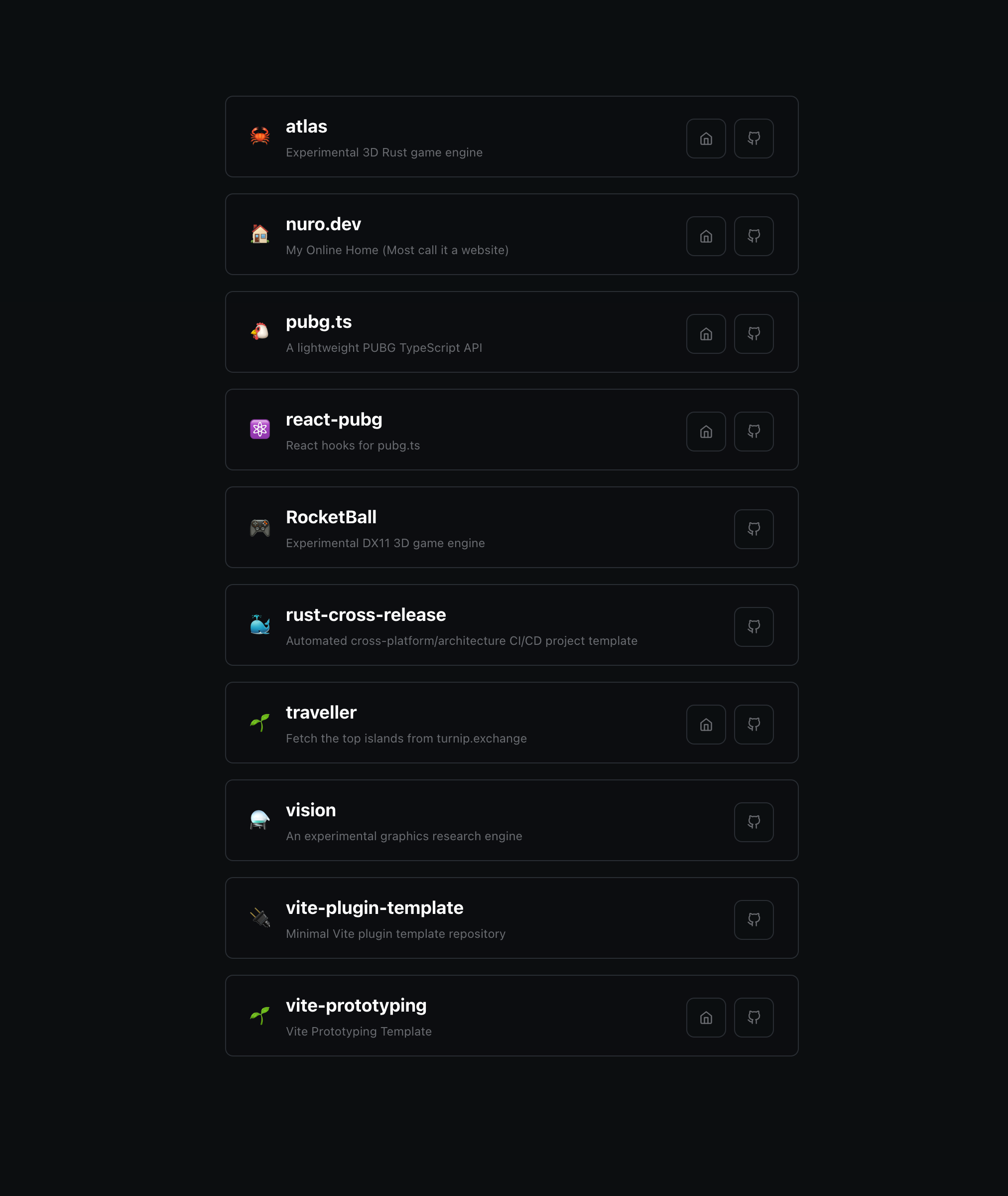
My new projects page has been redesigns to utilize server-side rendering for a very unique purpose. The page will show a select number of projects that are publicly available on my GitHub repository. However, the way they are selected is very unique.
Every request made for the page (That isn’t already cached) will return a newly server-side rendered page that is later hydrated on the client (As all SSR does). When performing the render, the server will go out and fetch all of my available GitHub repositories & then filter down all of them based on a number of filters. These include the following:
- The repository isn’t archived
- Contains the
portfoliotopic in the repository meta data
From there we then strip out the emoji suffix used in the repository description (This is a common practice I do to add a touch of color :rainbow:) so it can then be used as the project icon, with the description then being returned with that stripped out emoji. The rest of the data returned is pretty standard (Homepage URL, GitHub repository URL, etc).
With this I can update the contents of my projects page by using GitHub as a form of CMS. All I will need to do to add a project to my projects page page is add the portfolio tag to any of my repositories.

🕐 Timeline
When planning out my re-design I explored hundreds of portfolio websites. Some from big well known developers, to smaller less known devs. To very successfull designers, to students who have some really amazing looking sites so early on.
To quickly name a few that helped me a lot:
- jmswrnr.com
- leerob.io
- maximeheckel.com
- phineas.io
- wojtek.im
- www.joshwcomeau.com
- www.stuart.re
- www.twanmulder.com
That last one in particular I wanted to thank for this feature as I found it as a really nice way to track & record big events without having to do a blog post every time. With a bit of technical planning & building I was able to put together a simple JSON structure that would allow me to simply add a new object with simple data about the event to add it to my timeline page. Most of the heavy lifting of which is done by Next.js’s static site generation (SSG).
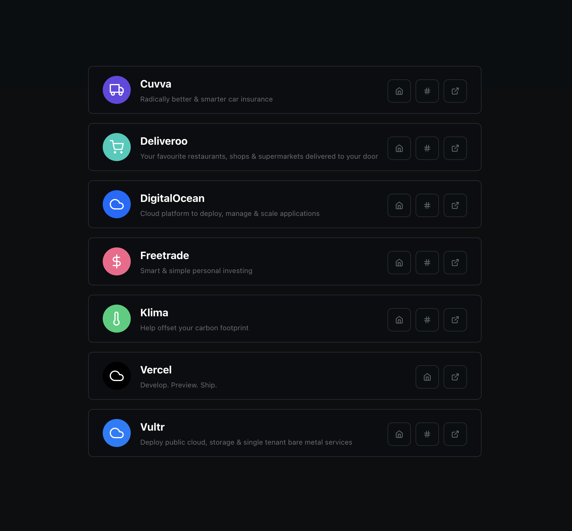
🔗 Referrals
A lot of companies now days offer a referral system. Everyone from big companies like Amazon & Tesla (Sadly they just ended it), to smaller startups like FreeTrade & Klima.
With more & more companies offering referral rewards, what better place to share mine than on my personal website ¯\_(ツ)_/¯
This page is built almost identically to my timeline page whereby a JSON structure is used to store the data that is then compiled at build time into a static page.

🔴 Status
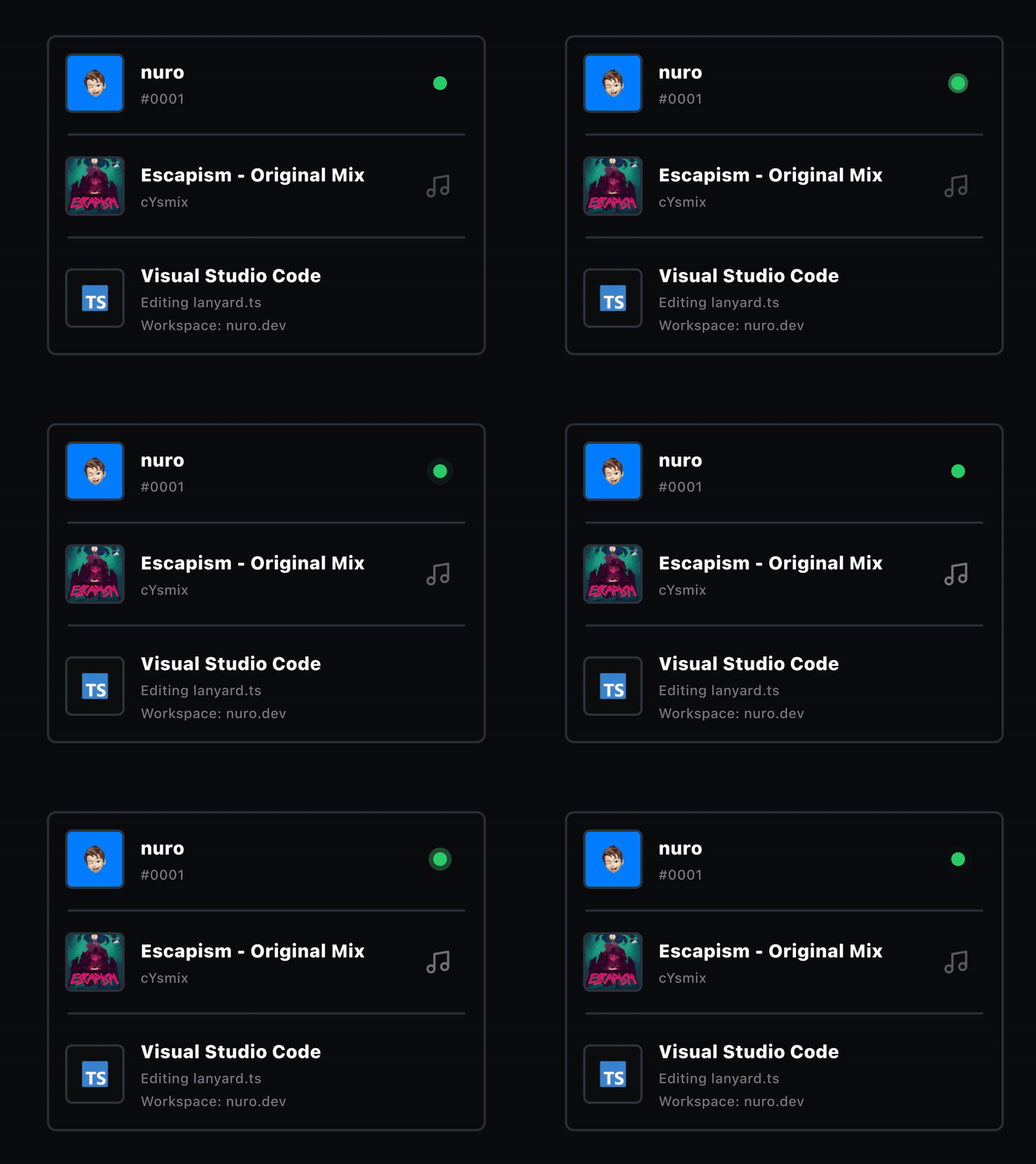
This next feature I am super happy with how it turned out & a HUGE credit has to go to @phineyes for his work on building & hosting Lanyard, a service to expose your Discord presence via a RESTful API or WebSocket.
Using Lanyard I was able to build a live status widget & indicator component(s) that mean, as long as I am online on Discord, anyone is able to view what I am listening to on Spotify, what game I’m playing or even whatever I am coding thanks to a Visual Studio Code extension that adds rich presence to Discord.

🌙 Theme
A very common feature now days is offering multiple themes for an application. My previous site iteration was no stranger to this as it would switch between light & dark themes based on the users system preference. This worked very well, until you wanted to manually override is. As such I have, again, added both light & dark modes as I did before, but this time offer a way to manually override this setting from your system setting.
🔈 Sound
A fair few of the portfolio websites I looked at always had a nice touch of flair & one such touch I always found that I really liked was sound. Nothing crazy like playing music in background the whole time, but instead just subtle sound effects like button clicks, etc.
It’s a small addition, built using use-sound, that adds some depth & makes the site feel much more interactive.
Currently the click sound is the only sound effect… For now. In the future I would like to experiment adding more sound effects to the site to continue expanding the feature. One such sound effect I have in mind I plan on looking into in the future is a envelope opening sound for when opening a blog post, or something similar? Not too sure yet but a nice idea I feel.
♿ Accessibility
The final fea… Well, kind of a feature but more of a much needed improvement has been accessibility.
My previous website iteration met a lot of the minimum requirements for basic accessibility, however it could have been a lot better. Since the launch of that site I have learn’t a LOT about the importance of accibility when designing & building websites / applications. As such I wanted to do my very best when building this one to improve it & make it as accessible as possible.
Here are some of the notable accessibility features/improvements:
Alt tags
Something small but very noticible is adding alt tags or aria-label’s where possible. This includes any & all images and buttons. This way screen readers are able to actually understand what the element is & read it back to the user.
Focus Highlights
Primarily brought to my attention by the work of Discord via there focus-rings package & TailwindCSS offering a new ring style system aimed at helping with focus visiblity & accessibility.

Keyboard navigation
While not complete coverage, I aimed to offer complete or near complete keyboard navigation as it can aid with accesibility systems by ensuring that all items both can be navigated to at all, but also in the order you need.

Reduced Motion
When implementing my very pretty & fancy looking particles background, I started to consider the performance & accessibility implications of offering such animations. As such I began researching into motion & animation accesbility in the web.
From there I found out about the prefers-reduced-motion CSS media query. By defualt when my site first loads, the initial state of the animations setting will default to whatever this query provides. If for whatever reason though this fails you are still always able to toggle off animations manually via the settings icon in the top right at all times.
With this setting I am toggle not only the background aniamtion graphic off, but also toggle off the transitions that are wrapping several components on several pages.
Settings toggles
Following from the reduced motion toggle mention above, the settings dropdown, which is always located in the top right of the screen, also contains toggle buttons (Both displaying an icon to represent the icon as well as a checked icon to represent its current state) for toggling between light & dark theme, as well as to toggle sound effects.
Caveats
While I have tried to put in a good amount of time trying to add accessibility options & be as accomadating as possible, it is still not perfect.
Here are some ways I still want to eventually improve the accessibilty even further:
- Reduced motion event listener updates settings
animationsstate - Improve animated background performance by using
GPGPUfromogl - Set theme back to using system theme instead of user override
- Many more to come
I will always try to improve accessibility where possible. If you feel I am missing a key feature of accessibility, please reach out, let me know & educate me on its importance so I can try enforce its use in future & in other projects.
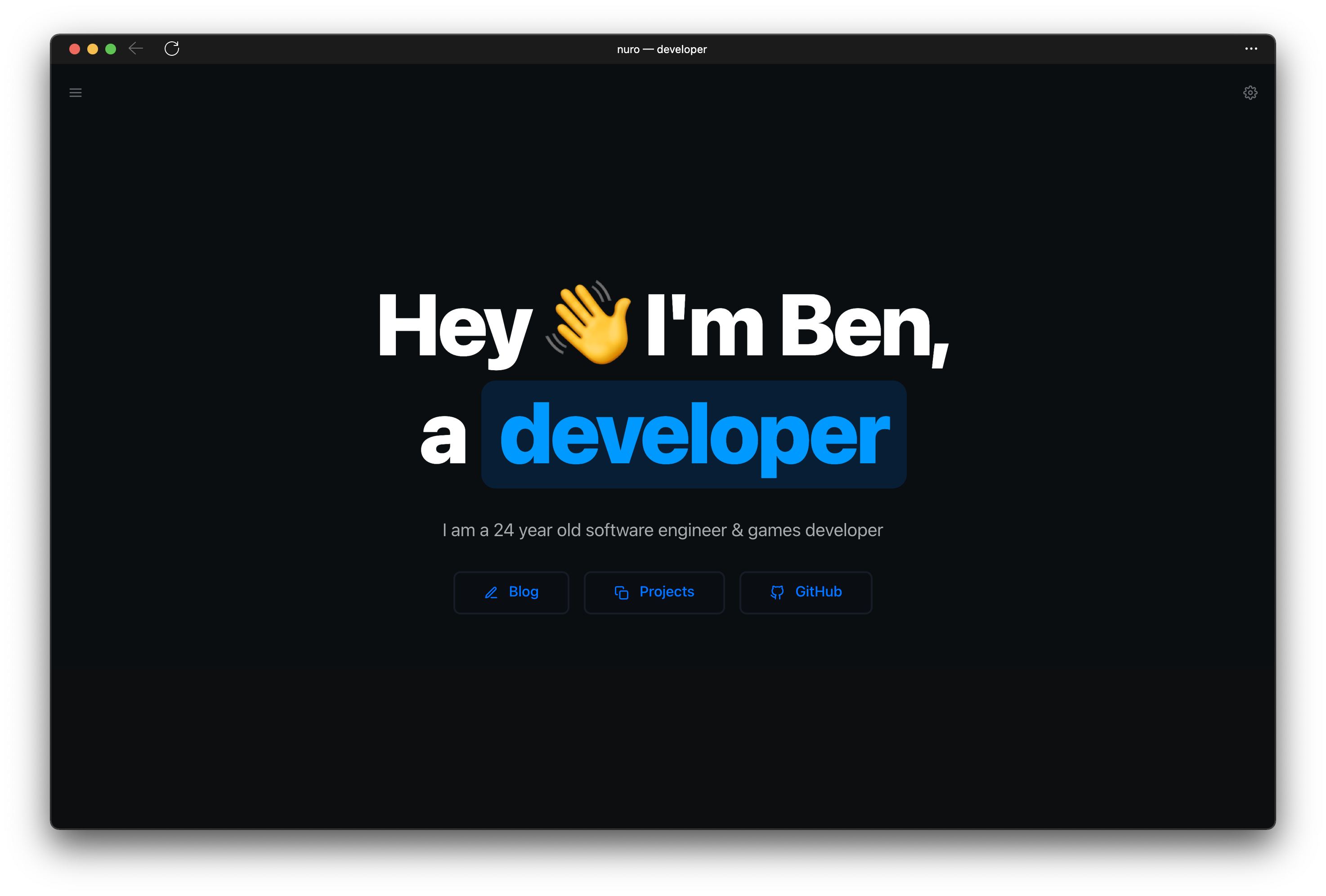
The Result
And with all of that, we have the final result of what you are looking at right now!
